The Brief:
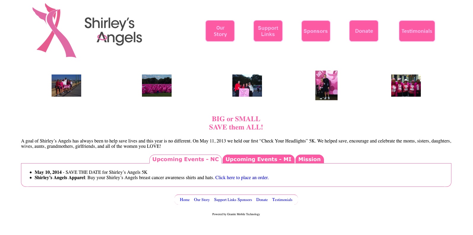
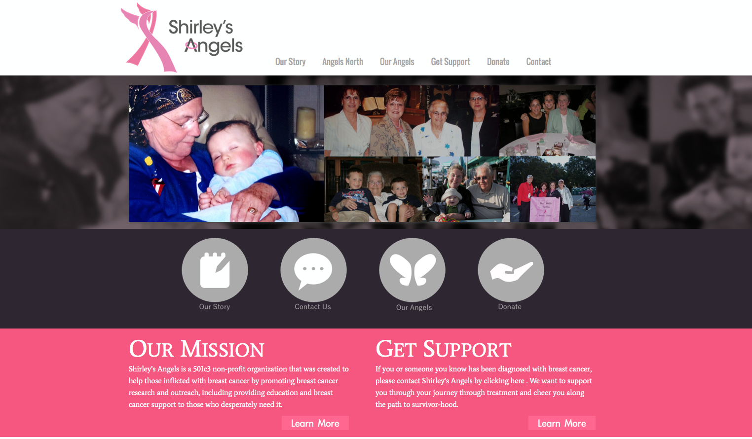
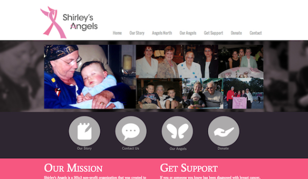
The client needed a website redesign for their non-profit organization. The website needed to be easy to use and easy to find information about their cause. It also needed a way to easily donate and represent its story throughout the design.
The Process:
Once we understood our client's needs we wanted to make their story the main focus of the website. We decided to use the hero space to showcase meaningful photos that showed why this non-profit exists. The website needed clear and easy navigation, in order to achieve that we made big, clear buttons that linked up to all the important pages of the website. We wanted people of all ages to easily find exactly what they were looking for. In addition, the old website was not mobile-friendly, so we created a fully responsive website to make sure mobile users could fully utilize the website.
The Results:
The website was delivered on time and our client was really excited about their new website. We were able to improve on all aspects of the website and showcase the essence of the organization.
